
Featured image from Akshay93 via Pixabay
What you wear to the office can profoundly influence how your colleagues and superiors view you. The colors you wear can even affect your chances of promotion.
No one likes being judged on their appearance. However, science has proven that what you wear to work can affect how your coworkers view you.
RELATED ARTICLE: HOW TO PICK THE RIGHT COLOR FOR YOUR BUSINESS OFFICE
The Psychology of Colors
The science behind color psychology is all tied up with how specific colors affect perceptions and emotions. There is not doubt that certain colors make an impression. For example, designers often use blues for relaxation, purple to awaken the senses, and vibrant yellows and oranges to provoke feelings of excitement.
People view some colors more positively than others. This means that the colors you choose to wear in the office environment can have significantly influence how others viewe you. And the people you work with are the people you spend more time with than anyone else.
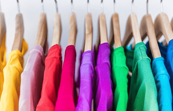
Best Colors to Wear in the Office
You can pick the color to best suit your mood or the mood you wish to project to your colleagues. These are the best colors to help you dress to impress at work.
Green
Wearing green radiates a feeling of safety and freshness associated with the great outdoors. Green is synonymous with several positive characteristics and features. For example, we associate green with “go” as well as with the humble dollar bill. Moreover, green is a calming color that sits easily on the eyes, minimizing eye strain for those sitting in front of a computer monitor all day.
Blue
Blue is a color people associate with wisdom, knowledge, and truth. It is well-known to be a relaxing color, and designers regularly use it as a calming influence. This makes wearing blue a superb option to counteract the tension and angst often found in a more volatile workplace, as it promotes stability. Blue suits seem to be among one of the most selected options by office workers.
Brown
The color of wood, which also promotes stability, brown is found regularly in nature alongside green. Brown provides the rock-solid foundations upon which the green leaves of trees and hedgerows can flourish.
People often view brown as a masculine color. However, women can use brown to their advantage in a male-dominated workplace to promote strength, independence, and assertiveness.
During sunny periods, brown sunglasses can work wonders. Burberry, for example, has a great selection of smart yet stylish shapes to take a look at. Follow this link to learn more about them.
Black
Black is the color of power, mystery, and seriousness. Often worn in the workplace due to its thinning effect on the body, the elegance associated with black clothing emits dominance and self-confidence. Adding a splash of color, such as green or blue, can provide an element of relaxation to the ensemble without lessening the seriousness of black.
Worst Colors to Wear at Work
While some colors promote an image of stability, security, and professionalism, other colors have been found to leave colleagues feeling more insecure, unsafe, and unsure. Here are colors to avoid wearing too often around the office.
Gray
Colleagues often see people wearing too much gray as being passive, lacking care, and not wanting to be involved in what’s going on around the office.
It can promote a feeling of low energy that can turn co-workers away from them. However, pairing gray in moderation with a brighter color, such as blue or green, is an excellent way to lift the dullness and offset the negative connotations of gray.
Red
Red is a color people often associate with aggression and danger in the world outside the office. While red is also associated with passion, not necessarily a bad trait, red can raise blood pressure due to its links with fire, stop signs, and dangerous situations. In the office environment, red can come across as hostile, immediately putting colleagues on the defensive.
Yellow
At first glance, putting yellow—well-known as the happiest, most joyous color—on a list of what not to wear at work seems perplexing.
But while splashes of yellow can bring a feeling of brightness, joy, and excitement to the office environment, too much can prove to overstimulate the office. In fact, it can promote feelings of instability among coworkers.
Colors to Wear in Moderation
Using colors as accents to an overall look is an excellent way of adding personality to an outfit.
Orange
For example, orange is a less aggressive color than red. It promotes enthusiasm and can catch someone’s attention, working well as part of a predominantly brown ensemble.
Purple
Meanwhile, purple has a feeling of elegance, luxury, and royalty. Purple is the color of magic. Using purple as an accessory, such as on a tie or piece of jewelry, is a brilliant way to add mystery and elegance to your look.
White
Finally, most people associate white with perfection, cleanliness, and purity. However, too much white gives off feelings of sterility or timidity, which is counterintuitive to promoting confident, professional working relationships. White is always a good idea for a shirt or blouse, however, since it can match any other color to give off those strong, assertive, professional vibes.
RELATED ARTICLE: DESIGNING YOUR BUSINESS CARD FOR A PROFESSIONAL APPEARANCE
Why Your Workplace Colors Matter
Color enormously affects our moods and, as a result, the attitude we project. In addition, the colors we wear can affect our environment and how others see us. Understanding the psychological effect of specific colors can enormously influence our professional relationships and, ultimately, help us climb the career ladder.
RELATED ARTICLE: THE IMPORTANCE OF OFFICE COMFORT FOR PRODUCTIVITY