As we near 2018, the “mobile first” mantra should seem like old news to savvy marketers. For the first time in history, mobile officially accounts for more than 50% of all web traffic. In the e-commerce realm, mobile’s share is even higher: nearly 60% in Q2 2015, according to Andrew Meola of Business Insider. The figure has assuredly grown since then.
If your retail website isn’t already optimized for mobile traffic, or at least responsive to small-screen viewing, it’s time to get on the stick.
There’s a right way and a wrong way to do mobile, of course. Meola’s analysis shows that the mobile shopping experience remains far less satisfying than the desktop experience, largely due to poor website design and sloppy optimization.
Don’t be one of “those” e-commerce sites. Use these 7 mobile design tips to turn casual visitors into committed customers.
RELATED ARTICLE: 5 BUSINESS IDEAS TO START ON YOUR SMARTPHONE
1. Learn to Love White Space
Don’t worry about cramming as much information as possible into your e-commerce pages. Negative space, also known as white space, is arguably more effective at nudging prospects down the funnel than text or multimedia.
The reason is simple: Prospects confronted with too much information in their fields of vision are more likely to shut down than plow forward. A cluttered interface is more likely to raise your bounce rate than your conversion rate.
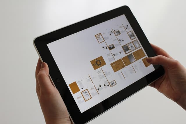
2. Don’t Forget About Tablet Users
“Mobile” is basically shorthand for “smartphone” these days.
That’s not fair to the millions of tablet users who prefer their high-res handheld panels to smaller-screened phones and bulky laptops. Early mobile adopters like Beyond the Rack were enthusiastic tablet boosters. Their experience shows that more detailed navigation and wider margins do still have a place in today’s e-commerce mix. Before you invest in tablet-friendly design, however, analyze your traffic sources to make sure that your core customers are amenable.
3. Use Push Notifications Judiciously
Under the right conditions, push notifications are highly effective closing tools. There’s no better way to put a limited-time closeout or flash sale on your customers’ radars. The alternative, a mass marketing email, just doesn’t cut it in a time crunch.
It’s very important not to overuse push notifications, however. Customers see overzealous “pushes” as a violation of their trust. After all, they gave you permission to notify them in the first place. If you don’t want them to disable notifications, keep this tactic in your back pocket for truly special occasions.
4. Make Buttons Big Enough
Big buttons sell more. Simple as that.
Your benchmark is the human thumb or forefinger—whichever you think your prospects prefer to use. For instance, the average thumbprint is about 70 pixels wide, meaning you don’t want your key buttons to be any smaller than that.
5. Cut Out Excessive Calls to Action
The less sales copy, the better. Instead, let your product pages do the talking. Size up your “buy now” and cart buttons, deploy high-resolution image carousels wherever possible, and use zoom features to give prospects as much detail as they need.
6. Display Progress Bars
Whenever you ask visitors to engage in a multi-step process, such as creating a new account or checking out with a purchase, display a progress bar that clearly shows how far along they are and how far they have yet to go. Whether you settle on a percentage meter, a linear dot plot, or some other configuration is up to you.
7. Reduce Text Entry Requirements
Smartphone text entry is bothersome, especially on devices without slide-out keypads (which very few new phones have). Your customers should have to exercise their typing thumbs only when it’s unavoidable—for instance, entering their shipping address for the first time.
Which mobile design practices are you using to boost your e-commerce sales? Use your creative skills to come up with more.