Photo by Artem Beliaikin from Pexels
Get your sign design right and you can expect more leads, more footfall, and greater brand awareness. In this article, we look at the power of color in sign design.
Your Sign as a Powerful Piece of Marketing
When you use color well, customers can easily read the messages on your sign. They learn to recognize the brand and might even share your brand with others. Moreover, the sign itself can become a focal point for passing traffic. When potential customers see an attractive and engaging sign, it becomes a powerful piece of marketing material.
RELATED ARTICLE: WORKING IN A COMPETITIVE INDUSTRY? TRY THESE 5 BUSINESS STRATEGIES
The Importance of Color in Sign Design
People make an immediate and subconscious judgment about a brand within minutes of coming across it. Moreover, the vast majority of individuals make their judgment on the basis of the colors they see. What’s more, up to 85 percent of consumers say that color greatly affects their decision to purchase. And as many as 80 percent say that the use of color helps to grow brand recognition.
Color has a major bearing on how well people understand the sign’s message. It also affects the person reading it and the ease with which they can absorb the message itself. Clearly, the psychology of color is more than just academic. In fact, the right colors can influence certain behaviors in your potential customers.
So are there “right” and “wrong” colors?
Choosing the Color Palette for Your Sign
The first thing to mention is that, when you’re deciding what colors to use, it’s usually a good idea to avoid basic black-and-white signs. On the other hand, customers will read an advertisement more than 40 percent of the time more if that ad is in color. This may mean more expense in your signage budget, but the return will be worth it.
Different colors stimulate different responses. For example:
Red
Red is associated with passion, fire, and heat. It tends to encourage customers to take risks, and it can stimulate feelings of energy, love, aggression, and power. Be mindful, however, that red also connotes danger.
Yellow
Yellow is another high-arousal color. It leads to feelings of hope and optimism. However, it also suggests betrayal.
Blue
Blue is cool and calm. It lowers blood pressure and can lead to feelings of cleanliness, order, security, and trust. There’s a reason professional services organizations, accountants, and businesses in the medical profession often use it.
Orange
Orange falls within the high-arousal spectrum. Use it in your sign to evoke a sense of balance, warmth, and energy.
Green
Use green in your sign to make people think of nature. It is also a popular shade for the wellness industry, thanks to its association with health and good luck. However, remember that it is also associated with jealousy.
Black
The color black in your sign will create a sense of mastery, tradition, mystery, and classicism. However, it also has negative connotations of evil.
Pink
Use pink in your sign if you want to elicit your customers’ feminine sides. Pink is warming, associated with love and gentleness. It’s often used in the service and retail industries.
Purple
Purple is a low-arousal shade that is associated with royalty. Use this color in your sign to evoke a sense of mystery and spirituality. However, keep in mind that purple is sometimes associated with arrogance.
Choosing Colors in Your Sign That Convey the Right Message
Choose colors for your business’s sign that will create the feelings you wish to arouse in your customer. Think about your brand and what you offer. What are you trying to convey with the message on your sign? Choose a color that supports your message, and you will create the right impression in your customers’ minds.
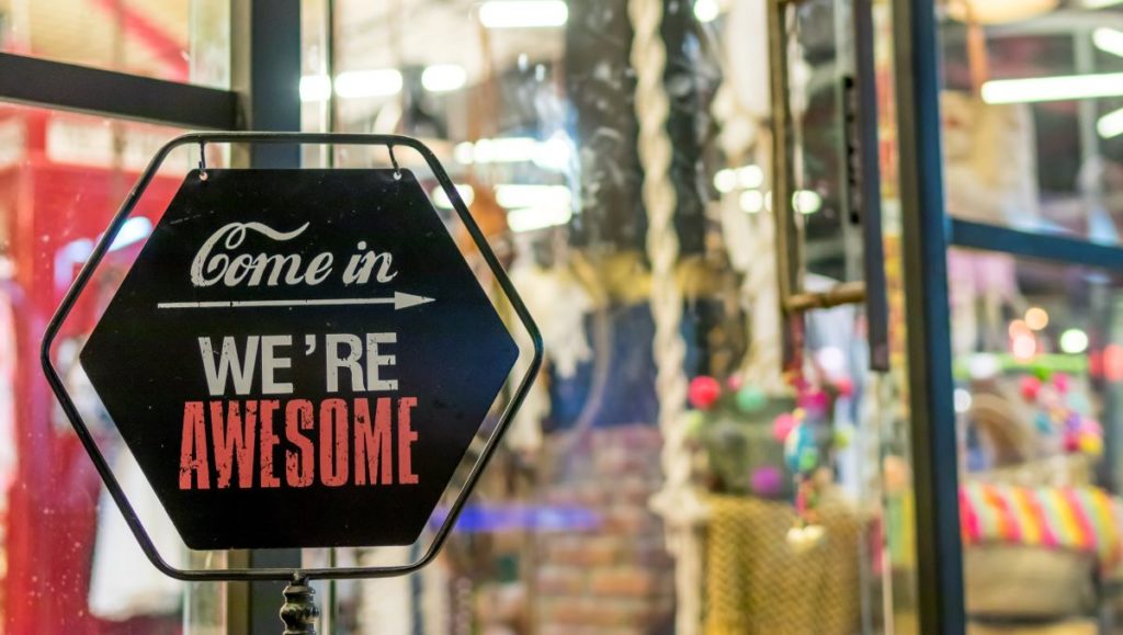
Sign Readability
Color aids readability. But the key is to get just the right degree of contrast.
For example, a light background paired with white text will be almost impossible to read from a distance. On the other hand, two primary colors together might clash and make viewers uncomfortable.
Also, you need to consider how light reflects on your sign. Ask your sign designer for advice as to the sign material that will best prevent glare.
A graphic designer along with a sign manufacturer can give you advice about how the right kind of signage can support your brand. You want to end up with a sign that brings in results and provides a lasting channel for your sales and marketing efforts.